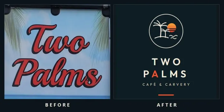
A proper rebrand used to be a five-figure line item and a six-week wait.
I’m no expert, but all it took was three photos taken using my mobile phone, one prompt, and about 30 minutes of compute to rebrand a product.
Here is the whole experiment. A little cafe and carvery in a sunny coastal town in Australia. Ok food, coffee, and signage built from a stock beach photo and some fonts someone dug up from the 90’s. I photographed the A-frame out front, the pole banner, and one page of the menu. That was the entire input.
Out the other side: a brand audit, brand guidelines, a billboard, social banners, print collateral, and a working HTML landing page.
The first pass took 16 minutes. To tweak the branding, I took a screenshot via Google Images of a logo I liked, prompted another version of the generated kit and 14 minutes later here we are. In total it took 30 minutes. It has taken me 4.5 times longer just to write this and get the content images sorted.
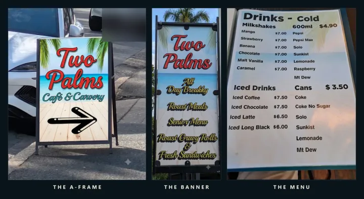
The entire input: three photos
No brief. No brand workshop. No mood board. Three photos taken from my mobile phone:
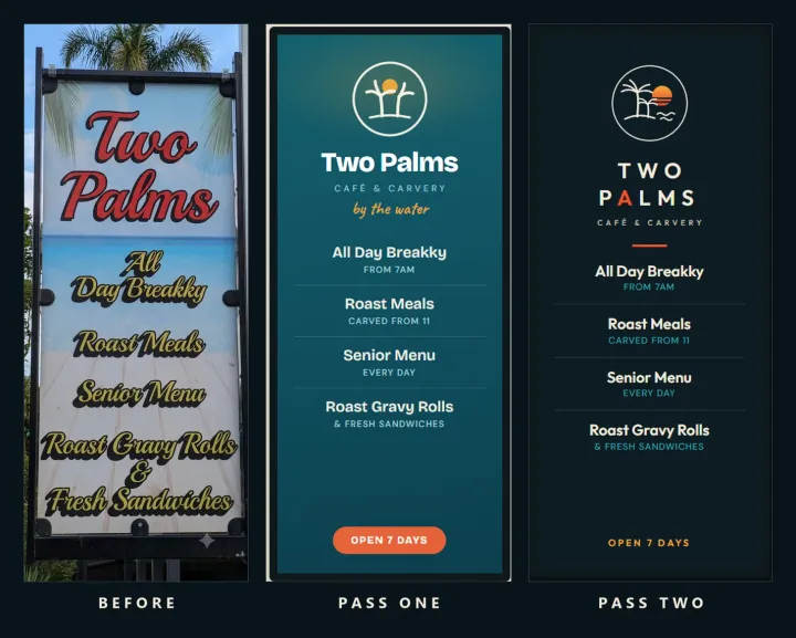
- The pole banner. Business name in red brush script over a beach photo, menu items in yellow script with drop shadows.
- The footpath A-frame. Same beach photo, a clip-art arrow, a third script for the descriptor.
- A menu page. Plain bold sans in a plastic sleeve, matching nothing else the business owns.
This style of signage and branding is not unique especially since the Cafe is only two years old. You cannot read it from a car. Nothing leads the eye. There is no logo to put on a cup. And the genuinely rare offer, a real roast carvery with an all-day breakfast, is buried behind a generic sunset.
The concept was right. The execution was terrible. That gap is what one prompt can now close.
Pass one: the prompt does the thinking
I did not ask for “a nicer logo.” Vague asks get slop. The prompt gave the AI a role, a process, and a rule: act as a senior brand strategist, work in four phases, and do not touch the design until the thinking is done.
- Deconstruct. Extract the existing brand DNA from the photos. Flag what is worth keeping.
- Audit. Score every touchpoint: legibility, hierarchy, contrast, consistency.
- Rank. Every problem in a table, ordered by commercial impact, not taste.
- Rebuild. Fix the critical issues, keep the good DNA, produce the actual assets.
The audit alone justified the exercise. Ten ranked issues. The top three: no hierarchy on the main sign, illegible at driving distance, and the differentiator buried. Each rebuilt asset then had to say which issues it fixed. The redesign was accountable to the audit, not just prettier.
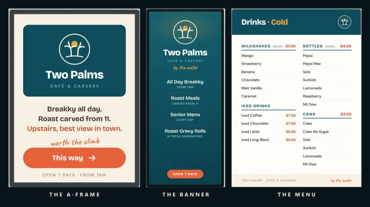
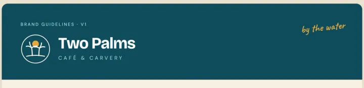
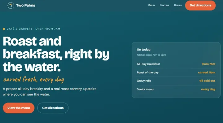
Pass one came back with the full kit: guidelines, billboard, banners, the collateral set, and a self-contained HTML landing page with real menu items and real hours.
The verdict on pass one
It was fine. Warm sand palette, one teal, one coral, a clean two-palm mark. Every audit failure fixed. A designer would call it competent.
The kind of tasteful-but-generic AI result you get when a very capable model has nothing to aim at. It fixed the problems without expressing a point of view. If I had stopped there, the cafe would have a better sign and a forgettable brand.
Pass two: one reference image to highlight how easy it is to shift the style
I went looking online and found a single logo that felt different. A dark badge. Line-art palm, sunset sun, waves, spaced capital letters. Minimal, confident, coastal.
I attached that one image to the next prompt with an instruction that matters: match the feel, keep the client’s colours, do not copy the mark.
The second pass mirrored what I was after. Same audit, same content, completely different vibe:
- A proper badge logo: two line-art palms inside a ring, a gradient sunset, waves. The name of the business, drawn literally.
- The client’s original red, yellow and teal, re-tuned instead of replaced: sunset coral, sun gold, lagoon, on deep reef ink.
- Spaced-caps wordmark, zero script fonts, one accent doing one job per surface.
- The same banner, A-frame, and menu rebuilt to compete head-to-head with the originals, plus a dark, vibrant landing page.
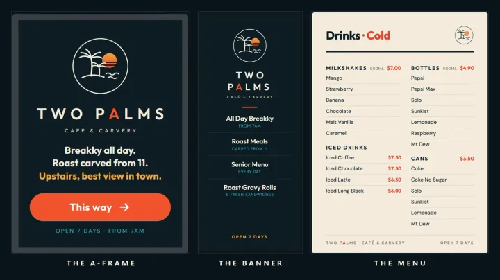
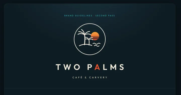
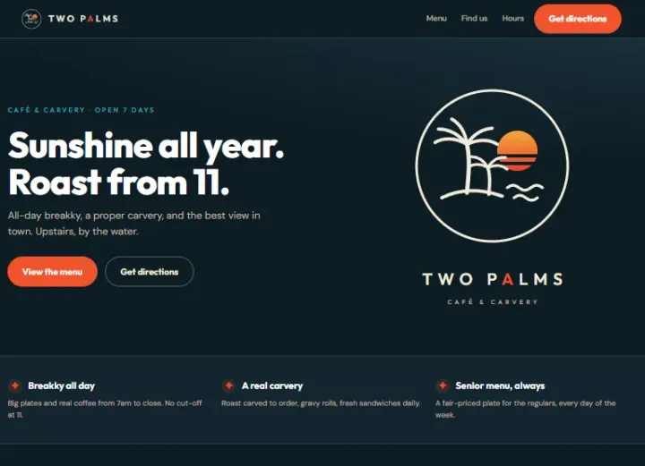
The lesson inside the lesson: to get the output you want, you have to direct AI, and a reference image is worth a thousand words of prompt. I spent zero words describing “premium minimal coastal badge identity.” I showed it one picture instead.
The maths that should make anyone in business stop and think
Add it up:
- Input: three photos taken using my mobile phone and one borrowed reference image.
- Time: roughly 30 minutes of compute across two passes, plus my review between them.
- Cost: a $30-a-month AI subscription. No agency, no freelancer marketplace, no six weeks.
- Output: an audit with ranked commercial priorities, two complete brand directions to choose between, print-ready collateral concepts, and a working landing page.
A studio would quote thousands for the strategy phase alone, and it would be four to six weeks before you saw a direction. This is not about replacing the studio. A great designer still beats this output. It is about the starting line moving. A small business can now get the ball rolling for the cost of lunch, see two real directions, and then decide whether to spend real money.
What the 30 minutes did not include
The AI supplied the craft. The judgement stayed human. Four things it could not do:
- Spotting the opportunity. No model told me this cafe deserved better. Seeing the gap is the skill.
- The taste call. Pass one versus pass two is a decision, not an output. Someone still has to choose the reference that steers it.
- Permission. This whole case study is anonymised to avoid embarrassing the owners.
- The last mile. Font licensing, print vendor specs, real food photography. An afternoon of unglamorous human follow-through.
Strip those out and you ship a confident redesign nobody asked for. Keep them, and a $30 subscription turns one motivated person into a small branding studio. My hidden message, industry experts in content and marketing need to be curating AI, there no need to compete. Shift 80% output to machine intellgence and 20% reamins as the human expert to judging, verifying, refining, and curating machine intelligence.
Run this on your own street
The whole method, start to finish:
- Photograph three touchpoints. The main sign, the street sign, one menu or price list. Phone quality is fine.
- Run the four-phase prompt. Deconstruct, audit, rank, rebuild. Do not let it skip to the pretty part. The prompt is the free kit below.
- Grade pass one hard. If it feels safe, that is normal. It is a first draft with no taste input.
- Find one reference image. A logo or brand whose mood matches what you want. Attach it. Say “match the feel, keep our colours, do not copy.”
- Compare the passes against the original. Put all three side by side. The direction usually picks itself.
Thirty minutes of compute. A $30 subscription. Three photos. The expensive part of branding was never the software, it was the start. The start is now nearly free, and it is sitting out the front of every shop on your street.
Found it useful? Send it to one person who runs a shop that deserves a better sign.
The Brand Makeover Kit is a free three-page kit below. The exact four-phase prompt, plus the reference-image trick from pass two. Save it
Download: Quiet Tools 06 Brand Makeover (PDF)
Thanks for reading. I build with AI and share what I learn as I go. Subscribe. Its free. Subscribe on Substack.